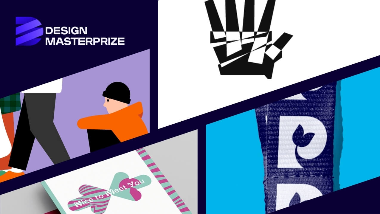
Brand identity design is one of the most requested, most discussed, and most misunderstood disciplines in graphic design. Everyone has seen the rebrands that went wrong, the logos that generated backlash, the identities that looked polished but communicated nothing. The projects below are the opposite. Recognised at the Design MasterPrize (DMP) 2025 edition, each one starts with a problem worth solving and arrives at a visual language that makes the answer legible.
What Separates Good Brand Identity Examples from Forgettable Ones?
The projects in this selection share one quality: every visual decision traces back to a specific idea. The symbol comes from somewhere. The typeface earns its place. The colour palette is not a preference but a position. That relationship between concept and execution is what the DMP jury looks for, and it is what makes these brand identity examples worth studying.
Parkinson's UK, Red Stone - Best of Best, Brand Identity
- Designer: Red Stone creative and project teams
- Location: London, United Kingdom
- Client: Parkinson’s UK
- DMP Category: Brand Identity
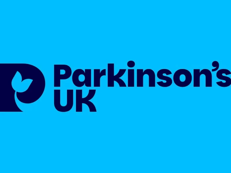
A charity rebrand is one of the harder briefs in brand identity design. The organisation is known, the audience is emotionally invested, and the stakes of getting it wrong are real. Red Stone’s work for Parkinson’s UK navigates all of that through a single, grounded research insight: people affected by Parkinson’s need help now, not promises about future breakthroughs. That led to the proposition “Pushing for better. Right here. Right now” and a new visual identity built around a tulip, the international symbol for Parkinson’s, alongside Parkinsans, a custom open-source typeface designed for maximum accessibility.
Why This Brand Identity Works
The tulip is not decorative. It is a recognised symbol within the Parkinson’s community, which means the mark carries meaning before anyone reads a word of copy. The open-source typeface decision extends the accessibility principle beyond the brand itself, making the design infrastructure available to anyone who needs it.
View Parkinson’s UK Brand
St Mungo's, Red Stone - Winner, Brand Relaunch
Location: London, United Kingdom
Client: St Mungo’s
DMP Category: Brand Relaunch
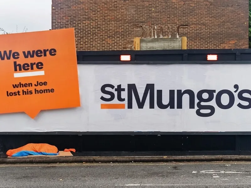
Red Stone’s second entry in this list is a brand relaunch for St Mungo’s, one of the UK’s most prominent homelessness charities. The organisation supports more than 2,300 people every night across southern England, and the brief was to make that work more visible and emotionally legible to a wider public. The resulting identity, built on a refreshed visual language, new illustration and iconography systems, and a revised tone of voice, was launched through a bold out-of-home campaign in London, including an attention-catching installation near Waterloo station. The campaign reached 10.3 million adults and delivered 88 million out-of-home impressions.
Why This Brand Identity Works
The measurable outcome is worth noting because it is rare: most brand identity case studies stop at the visual work and leave the effect implied. The St Mungo’s project delivers a quantified result, which is what transforms a portfolio piece into a brand identity example that professionals can learn from.
View St Mungo’s Brand
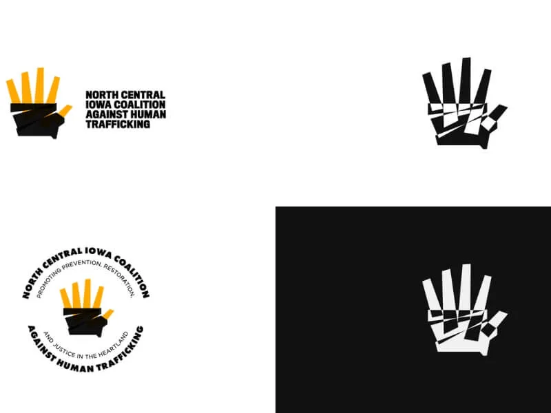
North Central Iowa Coalition Against Human Trafficking, Patrick Finley - Winner, Brand Design and Brand Identity
Designer: Patrick Finley
Location: Ankeny, United States
Company: Iowa State University, Patrick Finley
Client: Joseph Monvec
DMP Category: Brand Design, Brand Identity
This logo redesign works at several levels simultaneously. The mark shows a hand breaking free, but the shape of that hand also forms the silhouette of Iowa, locating the coalition’s work geographically without spelling it out. Black duct tape references the harsh realities of trafficking directly, bringing the subject matter into the visual system rather than softening it. Negative triangular cutouts within the palm represent the 20 counties the coalition serves. The geometric construction draws on the influence of Saul Bass, whose approach to distilling complex ideas into single, memorable forms remains one of the most useful models in logo design.
Why This Brand Identity Works
It layers meaning without becoming illegible. Each element carries its own logic, and they compound rather than compete. That is a much harder problem to solve than it looks.
View North Central Iowa Coalition Against Human Trafficking
Nice to Meet You, Esseblu - Winner, Logo Design
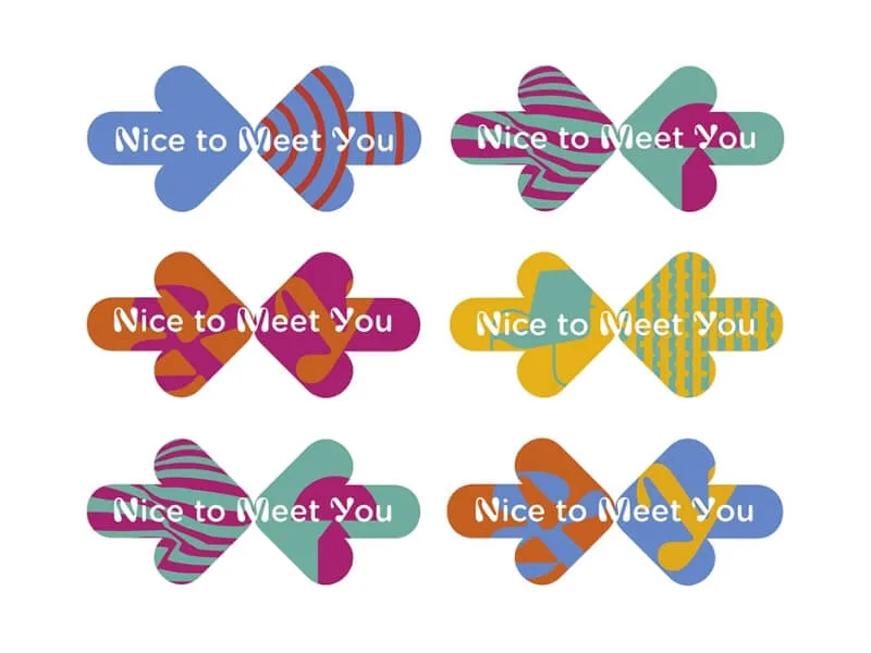
Designer: Susanna Vallebona
Location: Milan, Italy
- Company: Esseblu
Client: ADI Association for Industrial Design, Lombardy delegation
DMP Category: Logo Design
Nice to Meet You is a recurring networking initiative run by ADI Lombardia, bringing together members and guests at the ADI Design Museum in Milan. The brief called for an identity flexible enough to work across five different membership types, each of which needed its own variation while remaining part of a coherent system. Susanna Vallebona’s solution builds that flexibility into the identity architecture itself: five variations, one visual language, no version feeling like a subordinate of another.
Why This Brand Identity Works
Event identity systems are a useful test of brand identity design because they have to scale across applications, dates, and audiences without losing consistency. The Nice to Meet You identity solves that problem structurally, not decoratively.
The Thread Running Through These Brand Identity Examples
Four projects, three countries, three studios. The range is still the point.
Strong brand identity examples do not share a visual style. They share a methodology. Each of these projects began with a question worth answering, conducted some form of research or reflection to find the right answer, and built a visual language that makes that answer visible without explaining it. The Parkinson’s UK tulip does not require a caption. The Iowa hand does not need a legend. The Nice to Meet You system teaches you its logic the moment you see all five variations together.
That is what brand identity design is supposed to do: communicate something specific about an organisation or moment in time, using only what needs to be there.
Enter Your Brand Identity Work in DMP 2026
The Design MasterPrize is open for entries across Graphic and Communication Design, Product Design, and related disciplines. If you are working on brand identity, logo design, or visual identity systems, the 2026 edition is open now.